 Visualisation
Studio Athenos · Healthcare Project Profile
Dr. Bothra's Diagnostic & Imaging Centre
Bikaner, Rajasthan · Designed by Ar. Rahul Saxena
Visualisation
Dr. Bothra's centre was never short of space; at roughly 20,000 sq.ft it had room to plan generously. The problem was one of relationship, not area. A diagnostic laboratory does its most sensitive work away from foot traffic, dust and the flow of the general public — yet it cannot be sealed off to the point where samples, reports and staff lose quick, reliable contact with the floors it serves. The centre had to hold two things that usually pull apart: a protected, low-traffic main laboratory, and a fast, continuous workflow tying it to the patient areas above.
The diagnostic programme split by tempo as well. Some investigations are quick and high-volume — patients arrive, are seen, and leave. Others are slow, sensitive and equipment-heavy, and need quiet, protection and time. Planning had to give each its own kind of space rather than force them through one shared floor.
The brief. The centre was commissioned to bring advanced imaging, a full pathology and molecular laboratory, and patient diagnostics into one building that runs as a single coordinated operation. The mandate was to separate the main laboratory from the general public while keeping it tightly and efficiently connected to the workflow — and to sort patient-facing services by how fast they move, so quick tests and slow, sensitive investigations never compete for the same space.
The ground floor carries the general public and the fast-moving work: waiting, sample collection, USG, digital X-ray, mammography, ECG and PFT — the high-volume, quick-turnaround tests where patients arrive, are seen and move on. These sit at the point of entry, where access is immediate and dwell time is short. It is also where the building meets the most people, so the corridors here are finished floor-to-ceiling in a soothing olive-green tile — a surface chosen to wipe clean and stay hygienic under heavy use, while reading as calm rather than clinical.
The main laboratory — around 2,400 sq.ft — is placed in the basement, deliberately removed from public circulation. Taking it off the ground floor keeps its work protected from foot traffic and gives it a controlled, low-disturbance environment, while its position directly beneath the public floor keeps sample and report movement short and direct rather than remote. It is separated for protection and connected for speed.
MRI and CT sit on the first floor with generous waiting space. These are the time-taking, sensitive investigations, and lifting them clear of the busy ground floor gives them the quiet, the protected envelope and the unhurried patient experience they need. Both are built with in-depth protection — magnetic-field safety around the 1.5T MRI, appropriate shielding for CT, and the structural reinforcement heavy imaging equipment demands. Because patients wait here longest, the material palette does the most work on this floor — the calm of the interior is not decoration but part of how the imaging experience is managed.
A single dumbwaiter connects all three working levels — the basement laboratory, ground-floor sample collection, and first-floor MRI/CT — so that samples and reports move between them easily and directly. Its position is chosen strategically to serve every relevant area from one line of vertical transit, which is what allows the zones to stay separated in use while behaving as one connected workflow. Specimen and report movement runs on the dumbwaiter, never back onto the public circulation the patients use.
Diagnostic interiors default to hard white and stainless steel, and they read as anxious. Bothra's interior was set against that. The soothing olive green of the corridors is carried through as the base note, warmed by wooden ceilings and American walnut veneer on the wall surfaces. The combination — green, timber and walnut — gives the spaces a refreshing, grounded quality that holds up to a clinical setting without feeling like one, so that a patient arriving for a test meets a building that feels calm rather than sterile. The palette is consistent enough to tie the public floors together while the finishes stay hard-wearing and easy to keep hygienic.
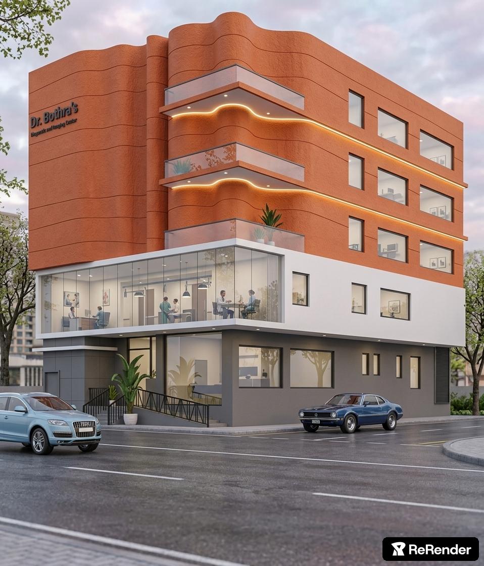
The building faces west into Bikaner's harsh desert heat — the hardest orientation on the hardest climate. Rather than fight that with glazing and shading devices, the design closes the western face almost entirely: a near-solid dead wall to the west is more useful here than any window would be, because it simply refuses the afternoon sun instead of managing it. The building can afford this because it sits on a corner plot — the upper floors take their daylight from the side, where the sun is kinder, so the west wall is free to do only one job: keep the heat out.
Freed of the need to hold windows, that west elevation became a wave. The wall reads as a single continuous, free-flowing surface — no punched openings to interrupt it — and the curve gives the centre a distinctive, unmistakable presence on the street. The move is quietly honest: the most sculptural face of the building is the one doing the most environmental work. It is climate turned into form. The wall that keeps the building cool is the same wall that makes it recognisable — protection and identity carried by one gesture, the way the section carries separation and connection by another.
The section of Dr. Bothra's Diagnostic & Imaging Centre reads as three working worlds stacked over one another, tied by a single line of vertical transit — and that is the whole argument of the design. The main laboratory sits in the basement because its work needs protection from the public it serves, but directly under the entry floor so that separation never becomes distance. The ground floor is open and immediate because it carries the quick, high-volume tests and the people who come for them. The first floor is quiet and heavily protected because the 1.5T MRI and the CT are slow and sensitive and cannot share a floor with that traffic. A single, strategically placed dumbwaiter threads all three together, so samples and reports move without ever touching the public route.
Inside, the building refuses the anxious white of the ordinary diagnostic centre — olive green, wooden ceilings and walnut veneer make the interior read as refreshing rather than sterile, which matters most exactly where patients wait the longest. And the west face is a closed, wave-shaped dead wall rather than an open, glazed one because, facing that sun in that climate, the envelope had to defeat the heat before it could do anything else — and being a corner plot, the building could take its light from the side and let the west wall be pure defence. The building looks the way it does because it refused the easy version — everything on shared floors, windows on every face, white on every surface — and instead gave each kind of work the separation it needed, kept all of it connected, made the interior calm, and turned its hardest climatic wall into its most memorable one. Separated for protection, connected for speed; closed for shelter, curved for identity. All of it is visible in the building itself.